The average cart abandonment rate is around 69%.
That means more than two-thirds of your customers add items to their cart, and then give up on your site before they check out.
That means you’re losing nearly seven out of nearly every ten sales.
That’s a lot.
If you can reduce your cart abandonment rate by even a few percentage points, you can enjoy a huge boost in sales and conversion rates.
So how can you optimize your cart?
Here are five changes you can make today to change your shopping cart abandonment rate forever.
1. Provide A Detailed Product Summary
One of the most important things you can do when you optimize your shopping cart is provide a detailed product summary, including a price breakdown of every item that’s in a customer’s shopping cart.
The more detail you have, the better.
Your customers should be able to confirm the items they’re purchasing, the price, and other such information all within the shopping cart.
Let’s use Tory Burch, a leading women’s fashion retailer, as an example:

As you can see, this page is chock-full of information, such as:
- Total items in the cart
- Cost of each item
- Summary of the total cost of the items, pre-shipping, and tax
- Estimated shipping costs
- Estimated tax costs
- Estimated total including shipping and taxes
- An area where users can enter a promo code
Having all of this information clear is essential for reducing shopping cart abandonment rates. 25% of customers abandon shopping carts because of unexpected shipping costs, and 23% abandon a cart because the total cost is not clear at a glance.
Don’t overload your customers with information. Put yourself in their shoes and think about what you want to see before you check out. Then use that information to optimize your shopping cart.
2. Make Each “Next Step” Clear
You want your shopping cart and checkout process to be simple, clear and easy to understand.
That means your customers should always be able to intuitively understand the “next step” they have to take to complete the checkout process.
Here’s an example from Zappos.
You clicking your shopping cart, you see this screen:

By using a clear cart summary, and a bold, contrasting “PROCEED TO CHECKOUT” button, you can clearly tell what the next step is to place your order.
The same is true of Zappos’ checkout screen:
 You can clearly see your order summary, total, shipping information, and payment method – and the “Place Your Order” button uses a different color than the rest of the page.
This minimizes any confusion about which button to click to proceed. It’s clear, simple, and easy to continue the checkout process.
Zappos has done a great job. They’ve no doubt dumped a ton of money to optimize their shopping cart. Simply duplicate what they’ve done as much as you can and you’ll be good to go.
3. Increase Size of Thumbnail Images
Take another look at the images above from Zappos.
One of the reasons this shopping cart is so good is the big thumbnail images.
This may seem like a small thing – but in our experience, customers like having a visual reminder of what they’re buying, and large thumbnails are a good way to give them that reminder.
A large thumbnail image can also help your customer catch last-minute mistakes – like an item they forgot to remove from the shopping cart, or an item that’s the wrong color or style. This helps reduce returns and order cancellations.
4. Keep Calls-To-Action Clear (And Distinct!)
Let’s take a look at the checkout page from Sephora, a leading cosmetics retailer. We’ve circled every call-to-action in red:

This is actually quite an extreme example. There are a total of 15 calls-to-actions alone – which is high for a shopping cart.
However, if you did not have the red outlines around each Call-To-Action, this would seem much less overwhelming. Why?
Because all of these calls-to-action are structured intuitively. The “CHECKOUT” button is the biggest on the page. Buttons for international and Canadian shipping are small, but highly visible below the checkout options.
The “Continue Shopping” button is small but highly visible. The “Recommended For You” section is easy to interpret – and can be ignored, if you’re not interested in more products.
Every Call-To-Action on this page is distinct and easy to interpret, and the most important one – checking out – is front-and-center, because it’s the largest button and the only red element on the page.
5. Make Accepted Payment Methods Clear From the Beginning
Nobody wants to go through a long checkout process – only to find out that they can’t pay with PayPal, or your website doesn’t take Discover or American Express.
Let’s use Sephora as an example again.
On the bottom-right of the order summary, there’s the following section:
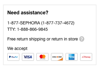
This makes it crystal clear which payment methods are accepted. Not only that, it provides customers with information about how to get help if they have a payment, shipment, or delivery issue. Nicely played, Zappos.
This small change helps build trust – and ensures that your customers have a smoother checkout process.
Follow These 5 Shopping Cart Design Tips – And Improve Your Conversion Rates!
You must make a commitment to improving your shopping cart.
Give your customers as much information as possible in an intuitive manner.
Make each step of the checkout process clear.
Use detailed thumbnails.
Ensure CTAs are clear.
Make it easy for visitors to understand your accepted payment methods, and how to get help if they have a problem.
These five simple changes are easy to implement but can have a huge impact on your shopping cart abandonment rate.
If you can do at least three out of five, you’ll be well ahead of your competition – and you’ll be able to reduce your cart abandonment rates, and increase your revenue and profitability.
Leave a Reply
You must be logged in to post a comment.